Button Overview
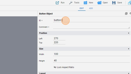
- The "ID" is a static attribute of the button (that means that its value cannot be changed dynamically with a UiSet command) used to change OTHER button attributes values dynamically
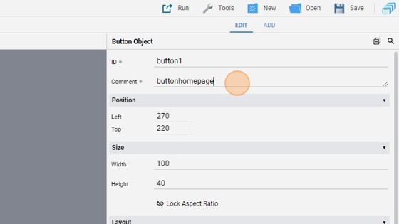
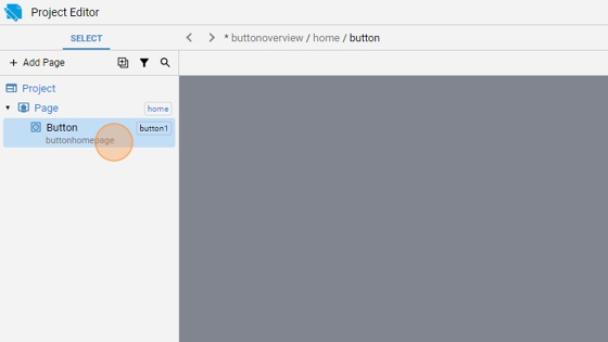
- The "Comment" is another static attribute that specifies a comment visible only in the "Project Editor". It is used to add a note or a tag to a button
- It is visible here in the "SELECT" panel
- The "Position" attributes specifies the button's left/top coordinates in pixels
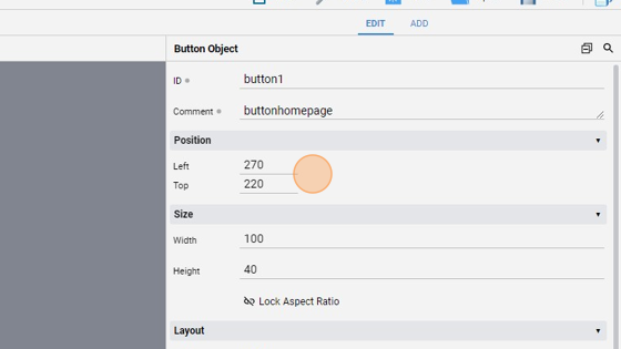
- The "Size" attributes specifies the button's "Width" and "Height" in pixels
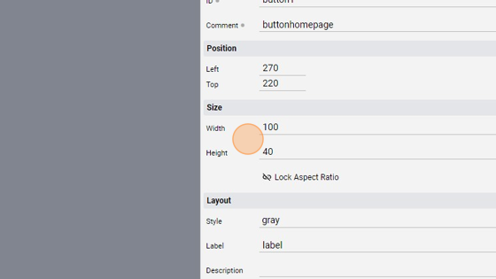
6. The "Style" attribute specifies the button style and color. The default value is "gray"
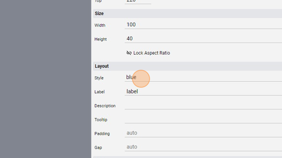
- As you can see the button is now blue

- The "Label" specifies a string to be displayed as the Label
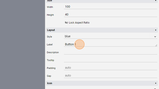

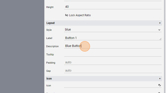
- The "Description" attribute specifies a description displayed below the "Label"

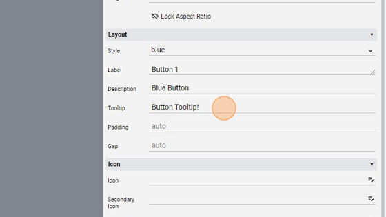
- The "Tooltip" attribute specifies a text displayed when hovering over the object
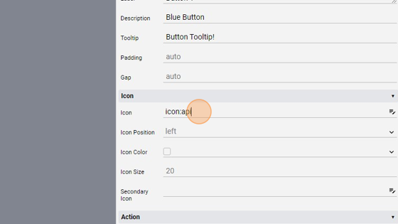
13. The "Icon" attribute specifies an icon to display. Its position can be changed with the "Icon Position" attribute (left (default), top, center, background)

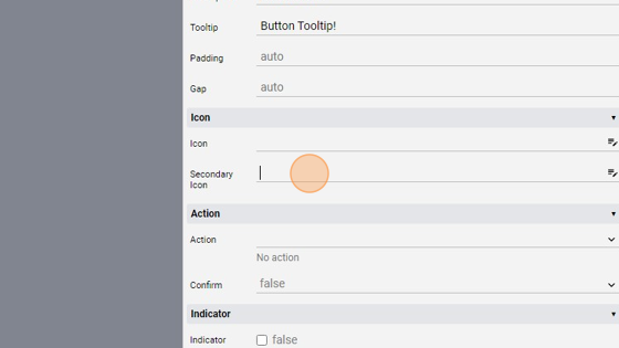
15. The "Secondary Icon" specifies a secondary icon to display. Its position depends on the "Icon Position" attribute, like the "Icon" before
16. The "Action" attribute specifies the action performed when clicked/tapped. We'll go in detail later in the turorial
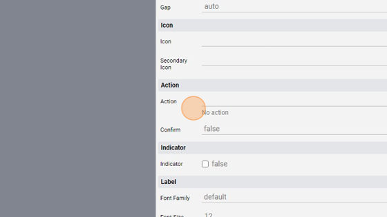
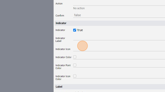
17. The "Indicator" shows an element in the top right corner, useful for notification. We can change the Label, Icon and Color

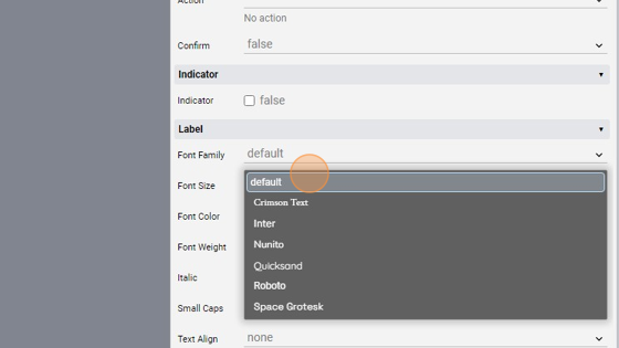
- The "Font Family" specifies the font family from the following:
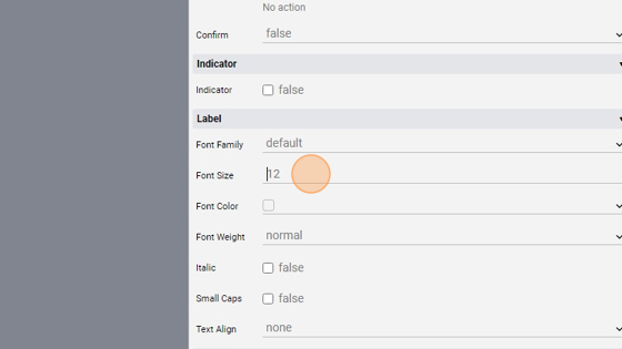
- The "Font Size" specifies the font size in pixels or percentage (relative to project font size)
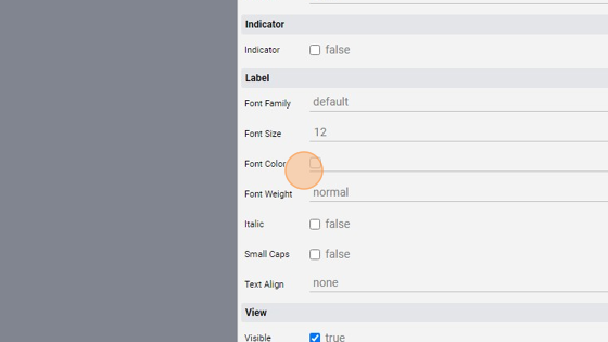
- The "Font Color" specifies the font CSS color
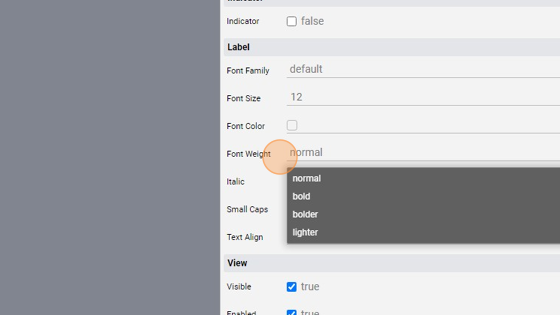
- The "Font Weight" specifies the weight of the font from the following:
- The "Italic" checkbox shows the text in italic
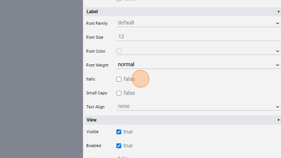
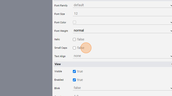
- The "Small Caps" checkbox sets the font to small caps
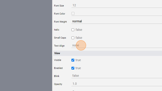
25. The "Text Align" sets the horizontal alignment of the text. It can be none (default, no alignment), left, right, center, justify
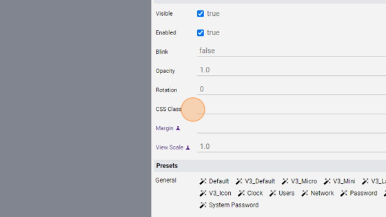
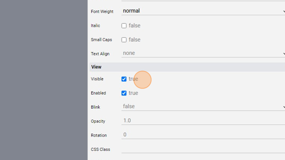
- The "Visible" checkbox sets the object visibility (visible or hidden)
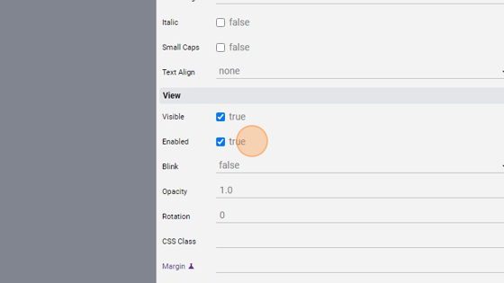
27. The "Enabled" checkbox specifies if the object is enabled or not. A disabled object appears as grayed out and can't be interacted with
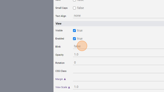
- The "Blink" attribute blinks the object at a specified speed (slow or fast)
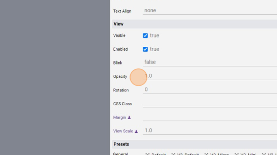
29. The "Opacity" attribute sets the opacity of the button. The opacity is the degree to which content behind an object is hidden
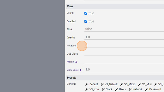
30. The "Rotation" attribute specifies the degree by which the object is rotated. A positive number rotates it clock-wise, a negative number counter-clockwise
31. The "CSS Class" attribute specifies a CSS Class that applies to the object, useful to customize its appearance. Custom CSS Classes are specified within the Custom.css file