Chapter 5: Project Editor
Every HSYCO installation needs a face; a way for people to control lights, check temperatures, open blinds, or see what's happening in a building. That face is called a project: a custom user interface that runs in a web browser, accessible from any phone, tablet, or desktop computer.
Think of the project editor like a desktop publishing tool, but instead of laying out text and images, you are laying out buttons, sliders, temperature displays, and camera feeds. You drag objects from a palette onto a canvas, position them visually, and configure their behaviour through a panel of attributes on the side. When you are satisfied, you click Save, then Run to open the interface in a browser tab and see exactly what your users will see.
This chapter is about the tool itself, not the individual objects you can place with it. You will learn how the interface is organised, how to navigate it, how to use its precision and search tools, and how to save and test your work. By the end you will have built a small working interface from scratch.
5.1 The Project Editor Interface
The Project Editor is divided into three main sections. In the central part you can see the project page you are currently editing. In the left column there is a tree list of all the project pages and the objects contained within them. In the right column you will find the attributes of the selected page or object, or of a group of selected objects.
Across the very top there is a menu bar: File, Edit, Tools, Run, and Help. Above the canvas there is a lightweight toolbar showing the current page name with back/forward navigation arrows, Undo, and Align. At the top right there are quick-access icons for Run, New Project, Open Project, Save, and Manager Apps.
5.1.1 The Central Canvas
The large area in the middle of the screen is the canvas, your visual editing area. It shows the page you are currently working on, exactly as it will appear when rendered (Figure 19). Objects you add appear on this canvas, and you interact with them directly: clicking to select, dragging to move, and dragging their edges or corners to resize.
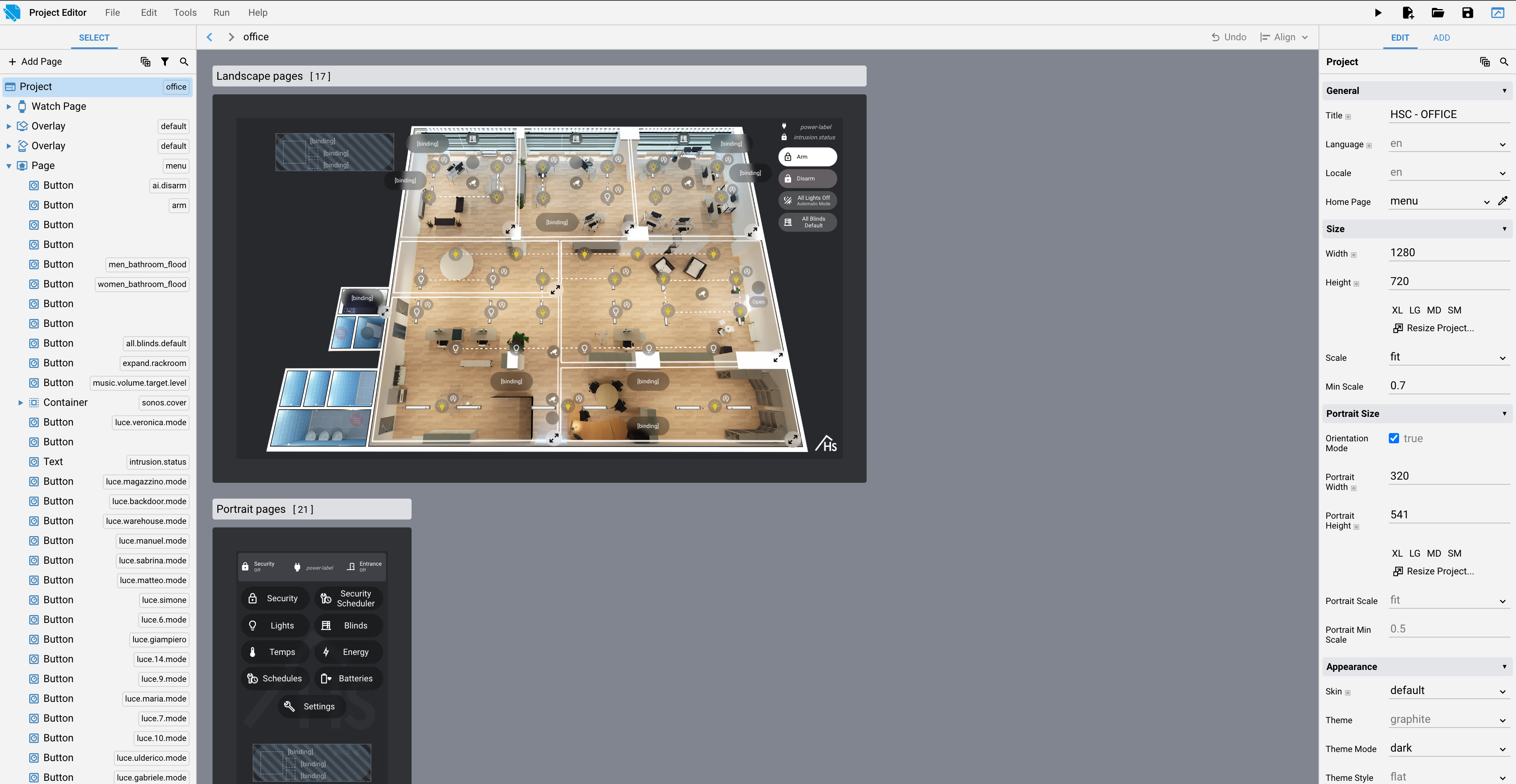
The Project Editor canvas
5.1.2 The Select Tree (Left Column)
To the left of the canvas is the Select tree, under the SELECT tab. It lists all the pages in your project, and within each page, all the objects placed on that page. The width of this column can be adjusted by dragging its edge.
HSYCO projects use these page types:
-
Page: a standard navigation page, the building block of any project. Available in a landscape and a portrait version.
-
Overlay: a persistent layer that sits on top of pages, used for elements that should appear everywhere, like a navigation menu or a status bar. Also available in a landscape and a portrait version.
-
Popup: a floating panel that opens on top of the current page, used for contextual controls or confirmations. Not affected by orientation.
-
Watch Page: a page designed for Apple Watch displays. A project can only have one: the Add Page dialog offers Watch Page as an option only until you've added one, then the option disappears.
Because regular pages and overlay pages each come in two orientations, the Add Page dialog lists those orientations as separate entries (Figure 20).
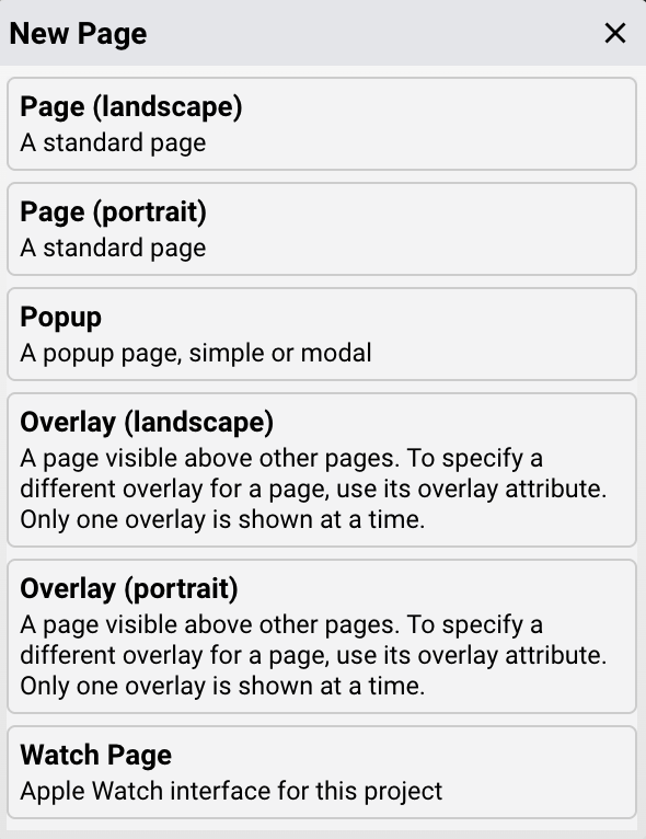
The Add Page dialog, listing the available page types
When you click on an item in the Select tree, that item is selected in the canvas and its attributes appear in the right column. This works in both directions: selecting an object on the canvas also highlights it in the Select tree.
Items selected in the Select tree can be dragged and dropped to other pages, making it easy to reorganise your interface as it grows. The order in which objects appear in the Select tree also determines how they stack visually on the canvas: items higher in the list appear on top, while items lower in the list appear underneath. This matters when objects overlap; if a button or label is hidden behind another object, dragging it higher in the Select tree brings it to the front.
At the top of the Select tree there is a filter for searching through your project. More on this in Section 5.2.1.
5.1.3 The Right Column: Edit and Add Tabs
The Edit tab is the attributes panel. When you select any item, the Edit tab shows all of its configurable attributes, organised into sections. This is where you set an object's position, size, colour, label, behaviour, and everything else. At the top of the panel, there is a filter for searching within the attribute list.
Clicking on the name of any individual attribute opens a submenu with additional options:
-
Documentation: opens a popup with the documentation for that specific attribute, explaining what it does and what values it accepts
-
Copy: copies the current value of that attribute
-
Paste: pastes a previously copied value
-
Copy From: copies the value from another object
-
Reset: resets the attribute to its default value at any time

The top of the Select tab in the Project Editor, with the Add Page button and the filter and search icons
The Add tab is the object palette. It shows all the objects you can place on a page. Show All in the upper section reveals every available object, including those from I/O Servers not yet declared in your configuration. A filter field at the top narrows the list, with the same options available throughout the Project Editor: Case Sensitive, Any Word, Whole Word, Inverse, and regular expressions. Pressing Enter while the filter field is focused adds the first object in the filtered list directly to the canvas.
5.1.4 The Canvas Toolbar
Directly above the canvas there is a lightweight toolbar. On the left, back and forward arrows let you navigate your page history. Next to the arrows, a breadcrumb shows the hierarchy of the currently selected object, for example, page/container/container/object. On the right, Undo reverses the most recent action, and Align opens a submenu of alignment actions applicable to a single object or a selection.
5.1.5 The Menu Bar
Across the top of the Project Editor there is a menu bar with five menus: File, Edit, Tools, Run, and Help.
File handles everything related to the project as a whole:
-
New Project: create a new project
-
Open Project: open an existing project
-
Open Recent Project: quick access to recently opened projects
-
Save Project: save the current project
-
Save Project As: save a copy under a new name
-
Show In File Manager: open the project folder in the File Manager
-
Rename Project: rename the current project
-
Revert Project: discard all unsaved changes and return to the last saved state
-
Version History: restore a previous version of the project (covered in the next section)
-
Close Project: close the current project
-
Delete Project: permanently delete the project
Edit is context-sensitive: its contents change depending on what is currently selected. The set of possible operations includes:
-
Cut, Copy, Paste: these work across different pages and across different projects entirely
-
Select All: selects every object on the current page
-
Group: combines the selected objects into a container, useful for moving or aligning them as a single unit
-
Delete: removes the selected items
-
Duplicate: creates a copy of the selected items
-
Bring Forward / Send Backward: moves the selected object up or down in stacking order relative to overlapping objects
-
Hide / Lock: hides or locks selected items in place to make editing a complex layout easier. This setting is saved in the project file but does not affect the project when it is running
-
Unhide All / Unlock: restores all hidden or locked items within the currently active container (the project, a page, or a container object)
These operations are also available via standard keyboard shortcuts, use the operating system conventions for your platform (Ctrl on Windows and Linux, Cmd on macOS), or by right-clicking on the object itself or on its entry in the Select tree to open the context menu.
Tools opens a submenu of editor settings:
-
Snap opens a submenu:
-
Snap To Grid: enable or disable snapping to a fixed grid
-
View Grid On Hover: show the grid overlay while hovering over the canvas
-
Grid Size: set the grid spacing in pixels (default:
10) -
Snap All: move and resize all objects in the current container to the nearest grid point
-
Snap Selected: move and resize selected objects to the nearest grid point
-
Snap To Guides: enable or disable snapping to alignment guides
-
Snap Margin: set the snap distance in pixels (default:
8) -
Sort Objects opens a submenu (available when applicable to the current selection) for reordering objects.
-
Source opens a submenu:
-
Project Source: open
index.xmlin the Code Editor -
Events (Server-Side Code): open the Code Editor in the EVENTS folder
-
Client-Side Code: open the project's custom JavaScript file in the Code Editor
-
Custom Css: open
custom.cssin the Code Editor -
Compact Layout: moves the Edit and Add tabs to the left column, freeing the right side for more canvas space. Useful on smaller screens or when working on wide layouts.
-
Preview Animated Backgrounds: enable or disable animated background previews while editing.
-
Experimental Features: show or hide experimental Project Editor features.
-
Deprecated Features: show or hide deprecated Project Editor features.
-
Qr: open the QR configuration popup, where you can generate a QR code for the project URL, for adding the project to the HSYCO App, or for sending a USER command to HSYCO.
-
Toggle Fullscreen: activate or deactivate full-screen mode.
-
Reset Dismissed Alerts: restores any alerts you have previously dismissed in the editor.
-
Resume Apps On Reload: when enabled, saves the current Manager workspace and restores it after a page reload, including the active app, open Code Editor files, and the current Project Editor project and page.
Run opens a submenu: run in landscape mode, run in portrait mode, open the current page in a new browser tab, or run in project debug mode which will be explained in section 5.2.7.
Help opens the Project Editor documentation.
At the top right there are also quick-access icon buttons: Run, New Project, Open Project, Save, and Fullscreen.
5.2 Using the Editor
5.2.1 Three Filters, One Mental Model
The Select tree, the Edit tab, and the Add tab each have their own independent search filter. The same filter also appears in Status Browser and Log Viewer. They all work identically, differing only in what they search:
-
The Select tree filter searches your objects and pages
-
The Edit tab filter searches attributes on the selected object
-
The Add tab filter searches the object palette
All three support the same four refinement options:
-
Case Sensitive: when enabled, the search matches only items with exactly the same letter casing as your search term
-
Any Word: returns results that contain any of the words you enter, regardless of their order
-
Whole Word: returns only results where the full word you entered matches completely, not partial matches
-
Inverse: excludes items that contain your search term, showing everything else
All three accept regular expressions and all have a Reset button.
Pressing Enter while a filter is focused behaves differently depending on where you are: in the Select tree, it selects the first matching item; in the Edit tab, it focuses the first matching attribute field; in the Add tab, it adds the first matching object directly to the canvas.
The Select tree filter searches by Object Type, item IDs, Comments, or attribute values.
The Edit tab filter searches by attribute name or attribute value. When a complex object has dozens of attributes spread across many sections, type the name of the one you need and the list collapses to just that item.
5.2.2 The Documentation Button
When you encounter an attribute you do not recognise, click its name in the Edit tab and select Documentation. A popup appears with the full reference for that attribute. Documentation is also available as a tooltip when you simply hover over the attribute's name.
5.2.3 Static and Live Attributes
As you read attribute documentation, two recurring notes matter.
Static attributes cannot be changed dynamically at runtime with a UISET command or a value binding. Their value is fixed when the project is saved. IDs, orientations, and most structural settings are static. If you need something to change at runtime, it cannot be a static attribute.
Live attributes are the opposite: they can only be set by the server at runtime and cannot be set directly from the Project Editor. If an attribute is marked live, there is no field in the editor to set it; it is driven entirely from automation code or server responses.
Understanding this distinction prevents a common mistake: trying to change an attribute at runtime with a UISET when that attribute is actually static; the value never changes, and nothing in the running project responds.
5.2.4 Snap and Advanced Mode
Snap (Tools menu) makes dragged objects automatically align to nearby reference points on the canvas. The submenu offers several related options:
-
Snap To Grid — aligns objects to a fixed grid, with Grid Size controlling the spacing in pixels (default: 10)
-
Snap To Guides — aligns objects to other object borders and page borders, rather than a grid
-
Snap All — moves and resizes all objects in the current container to the nearest grid point
-
Snap Selected — moves and resizes only the selected objects to the nearest grid point
-
Snap Margin — controls the pixel distance at which snapping kicks in (default: 8)
5.2.5 Organising for Orientation
A project that only needs one orientation, a fixed wall panel, for example, simply uses landscape pages only. A project that must work on both phones and tablets needs both landscape and portrait versions of each page. For orientation switching to work, the landscape and portrait versions of a page must share the same ID. When the device rotates, HSYCO looks for a page with the current page's ID and the new orientation. If it finds one, it switches. If it does not, it stays on the current version.
5.2.6 Version History
Every time you save a project, HSYCO automatically creates a timestamped backup of it. These backups are accessible from File → Version History, which expands into a list of saved snapshots ordered from most recent to oldest (Figure 22).
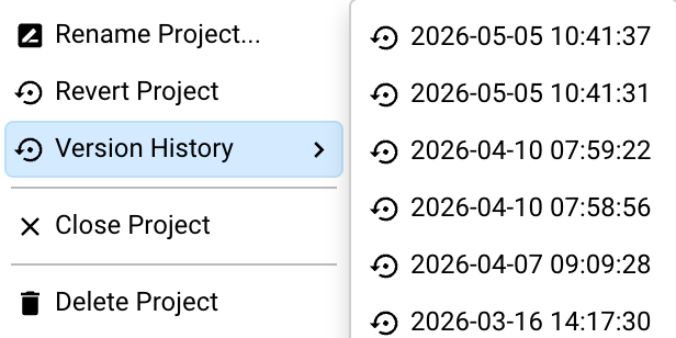
File → Version History: browsing saved snapshots
Clicking any entry loads that version into the editor, replacing the currently loaded project, but doesn't save it. You can browse through past versions freely and safely. The project is only overwritten if you explicitly click Save after loading a version. If you open a version and decide you do not want it, simply open the current version again from the history list or close without saving.
This is your safety net. If you restructure a page and it goes wrong, or you delete something you needed, open Version History, load a snapshot from before the change, check that it is what you want, and then save.
HSYCO manages how many snapshots are kept using a tiered retention strategy that balances recency with long-term coverage. The system reserves up to 28 slots total, distributed across five categories:
-
Recent: the last 5 saves, always preserved
-
Daily: one snapshot per day, up to 7 days
-
Weekly: one snapshot per week, up to 4 weeks
-
Monthly: one snapshot per month, up to 6 months
-
Yearly: one snapshot per year, up to 6 years
5.2.7 Debug Mode
The Project Editor includes a Debug mode, enabled from the Project Editor's Run menu or by setting the project's Debug attribute with a UISET. When active, a debug popup is displayed in the running project.
You can enable it indefinitely, or for a limited time, 10 minutes or 1 hour, after which it disables automatically.
Debug mode is controlled by the project's Debug attribute, which accepts three kinds of values:
-
true— debug mode enabled -
false— debug mode disabled (default) -
a timestamp — debug mode enabled until that specific time
Note: The Debug attribute is a live attribute, it is automatically set from the Project Editor's Run menu and cannot be set directly in the editor's attribute panel. It only takes effect when set dynamically, either through the Run menu or with a UISET command.
Debug Popup
The Debug popup is a live troubleshooting tool for HSYCO projects. It can be enabled from the Project Editor menu with Project Debug Mode, either indefinitely, for 10 minutes, or for 1 hour.
When debug mode is active, the client opens a popup with these tabs:
| Tab | Shows |
|---|---|
| Info | Browser session details: HSYCO version, screen and window size, browser and platform, current URL, timezone, and how long the page took to load and connect. |
| State | The live UI and Device state trees, updated while debug mode is active. |
| Commands | Client commands, parameters, responses, and errors. JSON and array values are expandable; commands can be exported as JSON or cleared. |
| IDs | Project objects listed by ID, type, and page. The target button selects the object and opens its page. |
| Attributes | The current attribute values of a selected object. |
| Options | The currently selected object, plus object-inspection tools. |
The target icon in the popup toolbar enables object inspection. After enabling it, click an object in the project to inspect it. Use Tab or the mouse wheel to cycle through overlapping objects.
The Options tab includes these actions:
-
copy: copies the selected object's JSON definition.
-
copy items: copies the selected object's table/list items, when supported by the object.
-
select parent: selects the parent object.
-
deselect: clears the current selection.
-
Disable command timeout: disables the default 10 second timeout for new commands while enabled.
The Attributes tab applies changes immediately in the current browser using the same client-side setAttribute() path used by UI updates. This is useful for testing the visual effect of a uiSet, but it does not execute a server-side uiSet(), persist the value, or update other clients. Changes may be overwritten by the next server state update or lost on reload unless the server sends the same value.
Note: The project's Debug attribute is accepted only when received from the server state. Setting it locally in the client does not start debug mode.
5.2.8 Objects You'll Meet in the Recipes
The Project Editor palette holds around ninety objects; Section 5.6 is a reference to the common ones. The recipes in this chapter and later ones lean on a handful worth knowing by name.
Nav is a navigation menu, a bar, sidebar, or toolbar of links between pages. Placed in an Overlay it appears on every page. Its Items attribute holds the links; Auto Config Items fills them in automatically from the pages already in your project.
Breadcrumbs shows the current location as a path, Home > Area 1 > Lights, and lets the user click any step to jump back up. It reads each page's Parent Page attribute, so set that on every child page.
Keypad is an on-screen number pad for entering a value; when its Name starts with $, HSYCO stores the entered value in that variable. It appears in the BACnet recipe in Section 10.3.4.
Datalogger draws charts, bar, line, or pie, from logged data. It has its own chapter: see Chapter 8.
Scheduler gives the end user a calendar-style editor for time-based rules. It is covered in Chapter 9.
5.3 Recipe: Build Your First Interface
This recipe walks through the complete process of building a small working interface from scratch. The goal is the workflow: the sequence of actions you will repeat on every project.
Step 1: Open the Project Editor
From Manager, click Project Editor. The welcome screen appears.
Step 2: Create a new project
Click New Project. In the popup, type a name: myfirst works. Remember: only lowercase letters and numbers, no spaces, and not manager. Click Create.
The editor opens with your new project selected in the Select tree. The canvas shows the project area. The right column shows the project's own attributes.
Step 3: Add a page
Click Add Page at the bottom of the Select tree. A popup lists the available page types, with regular pages and overlays split into separate landscape and portrait entries. Choose Page (landscape). The new page appears in the tree; click it to open it in the canvas.
In the Edit tab, find the Title attribute and type a title for the page, for example Home. You will see the page label update in the tree.
Step 4: Add objects
Click the Add tab in the right column to switch to the object palette. Find a Text object and click it; it appears on the canvas.
Switch back to the Edit tab. The Text object is selected and its attributes appear. Find the Text attribute and type something. Watch the canvas update immediately.
Now add a Button from the Add tab. It appears on the canvas too.
Step 5: Position and resize
Click the Text object on the canvas to select it. Drag it to where you want it. Drag a corner or edge handle to resize it.
Do the same for the Button. Use the Align menu to centre one or both objects; Center Horizontally and Center Vertically are the most commonly used options.
Step 6: Configure the Button
With the Button selected, switch to the Edit tab. Find the Label attribute and type a label.
Now click on the name of any attribute you do not recognise, for example Action, and select Documentation from the submenu. Read what it says. This is the workflow for learning any object.
Step 7: Save
Click the Save icon in the top-right area. Your project is saved to www/projects/myfirst/index.xml on the HSYCO server.
Step 8: Run and view
Click Run and choose the landscape option from the submenu. A new browser tab opens with your project running exactly as a user would see it.
Go back to the editor tab, make a change, move an object, edit the label, and save again. Wait for the project to rebuild, your project tab will automatically reload and reflect the change.
Step 9: Iterate
This is the cycle: edit → save → check. Repeat it until the interface is what you want. Use the Select tree to navigate between pages and objects. Use the attribute filter when you need to find a specific setting quickly. Use the Documentation button whenever you encounter something unfamiliar.
5.4 Recipe: Landscape and Portrait Interface with Navigation
This recipe builds a simple project with a landscape and portrait version of each page, linked so the interface switches automatically when the device rotates. Navigation is handled by a Nav object placed in an Overlay.
Step 1: Create the project
Create a new project. In the project attributes, make sure Orientation Mode is set to true.
Step 2: Add the landscape home page
Click Add Page and choose Page (landscape). Set its ID to home and its Title to Home.
Step 3: Add the portrait home page
Click Add Page and choose Page (portrait). Set its ID to home and its Title to Home. Two pages can share the same ID; HSYCO uses the orientation to choose between them.
Step 4: Link the two home pages
Pages that share the same ID are linked automatically, since both pages here are already named home, HSYCO already switches between them when the device rotates. No further action is needed.
You only need to set Portrait Page and Landscape Page explicitly if the two pages use different IDs.
Step 5: Add child pages
Add a Page (landscape) with ID area1 and Title Area 1. Set its Parent Page to home. Repeat for a portrait version: Page (portrait), same ID area1, same Parent Page home. As with home, the shared ID links them automatically.
Step 6: Add an Overlay for navigation
Click Add Page and choose Overlay (landscape). In the Add tab, add a Nav object. In the Nav's attributes, find Items and use Auto Config Items, this automatically creates link buttons for your existing pages.
Step 7: Save and run
Save the project and run it in landscape mode. Rotate the device or switch to portrait mode: HSYCO navigates automatically to the matching page.
5.5 Recipe: Portrait-only Interface with Breadcrumb Navigation
This recipe builds a portrait-only project where users navigate a hierarchy of pages. There is no Nav overlay, instead, a Breadcrumb object shows where the user is and lets them navigate back up the hierarchy.
Step 1: Create the project
Create a new project.
Step 2: Add the home page
A new project automatically includes a landscape home page. Since this recipe is portrait-only, select that existing page in the Select tree and change its orientation to Page (portrait) instead of adding a new one. Set its ID to home and its Title to Home.
Step 3: Add child pages
Click Add Page and choose Page (portrait). Set its ID to lights and its Title to Lights. In the Edit tab, set its Parent Page to home. Repeat for another page: ID automation, Title Automation, Parent Page home.
Step 4: Add a Breadcrumb via an Overlay
Click Add Page and choose Overlay (portrait). In the Add tab, find the Breadcrumbs object and add it, it appears automatically in the top-left corner.
Step 5: Add navigation buttons on the home page
Select the home page. In the Add tab, add two Button objects. Set the first button's Label to Lights and its Action to link, with Link set to lights. Set the second button's Label to Automation, its Action to link, and its Link to automation.
Step 6: Save and run
Save and run the project. Tapping a button navigates to that page. The breadcrumb shows Home > Lights or Home > Automation. Tapping any item in the breadcrumb navigates back up the hierarchy.
5.6 Interface Object Reference
The Add tab holds around ninety objects. This section is a quick tour of the ones you will reach for most often, grouped by what they do. For any object, click its name in the Edit tab and choose Documentation for the full attribute list.
A further set of vendor-specific objects, for security panels, AV equipment, and similar third-party systems, only appears in the Add tab once the matching I/O Server or protocol is configured in your project, so they aren't listed here.
5.6.1 Layout
| Object | What it does |
|---|---|
| Container | Groups several objects so they move, align, and show or hide as a unit. |
| Panel | A framed area used to separate or highlight a region of the page. |
| Divider | A horizontal or vertical rule that separates content. |
| Line | Draws a straight line between two points. |
| Shape | Displays a shape, such as a rectangle or circle. |
5.6.2 Display
| Object | What it does |
|---|---|
| Text | Displays a line or block of text; the everyday label, updated at runtime with UISET id.text. |
| Image | Displays an image file. |
| Clock | Shows the current time, with optional hour, minute, and second hands. |
| Progress | A progress bar for a value from 0 to 100. |
| Qr | Displays a QR code that opens a URL when scanned. |
| Html | Embeds raw HTML in the page. |
| Markdown | Renders Markdown-formatted text. |
5.6.3 Controls
| Object | What it does |
|---|---|
| Button | A clickable control: navigate (link), toggle a datapoint (datapoint), or send a command / user event (Chapter 7). |
| Switch | A toggle that shows and sets a binary on/off state. |
| Checkbox | A single checkable field, with an optional third "indeterminate" state. |
| Radio group | A set of mutually exclusive options. |
| Slider | Drag to set a numeric value within a range; used for dimmers and setpoints. |
| Stepper | Click up or down to change a numeric value in fixed increments. |
| Knob | Rotate to set a value. |
| Colorpicker | A panel for choosing a colour. |
| Keypad | An on-screen number pad; when its Name starts with $, the entered value is stored in that variable (Section 10.3.4). |
| Field | A general-purpose editable input: single-line or multiline text, date, time, a numeric keypad, or a selection list, depending on its type. |
5.6.4 Data and Devices
| Object | What it does |
|---|---|
| Chart | Plots one or more series of values. |
| Datalogger | Displays the statistics collected by a data logger, as bar, line, or pie charts (Chapter 8). |
| Camera | Shows a single camera stream or a grid of streams, with PTZ control (Chapter 13). |
| Map | A map with positioned markers. |
| Weather | A panel of current conditions and forecast from a weather I/O Server (Section 4.6). |
| Temp, Tempmini | A thermostat panel for one zone: current temperature, setpoint, and mode. |
| Table | Rows and columns of data, from a fixed list of items or a live data source. |
| List | A scrolling list of items. |
| Tree | A collapsible hierarchy of items. |
5.6.5 Navigation and Structure
| Object | What it does |
|---|---|
| Nav | A navigation menu, bar, sidebar, or toolbar of links between pages; place it in an Overlay to show it on every page. Auto Config Items builds the menu from your project's pages. |
| Breadcrumbs | Shows the current location as a clickable path (Home > Area 1 > Lights); needs each page's Parent Page set. |
| Steps | A step-by-step indicator that guides the user through a process. |
| Form | A group of input fields for entering and editing a set of values. |
| Calendar | Select a date, or display events on a calendar. |
5.6.6 Automation Panels
| Object | What it does |
|---|---|
| Scheduler | The end-user editor for the Scheduler's time rules (Chapter 9). |
| Timer | The end-user panel for a named timer. |
5.6.7 Apple Watch
A parallel set of objects, Watch Button, Watch Light, Watch Onoff, Watch Slider, Watch Shutter, Watch Label, Watch Image, Watch Camera, and Watch Speech, is used only on Watch Pages, for the compact Apple Watch interface.