Project Editor
The Project Editor is a very powerful Web-based visual editor you can use to create user interfaces.
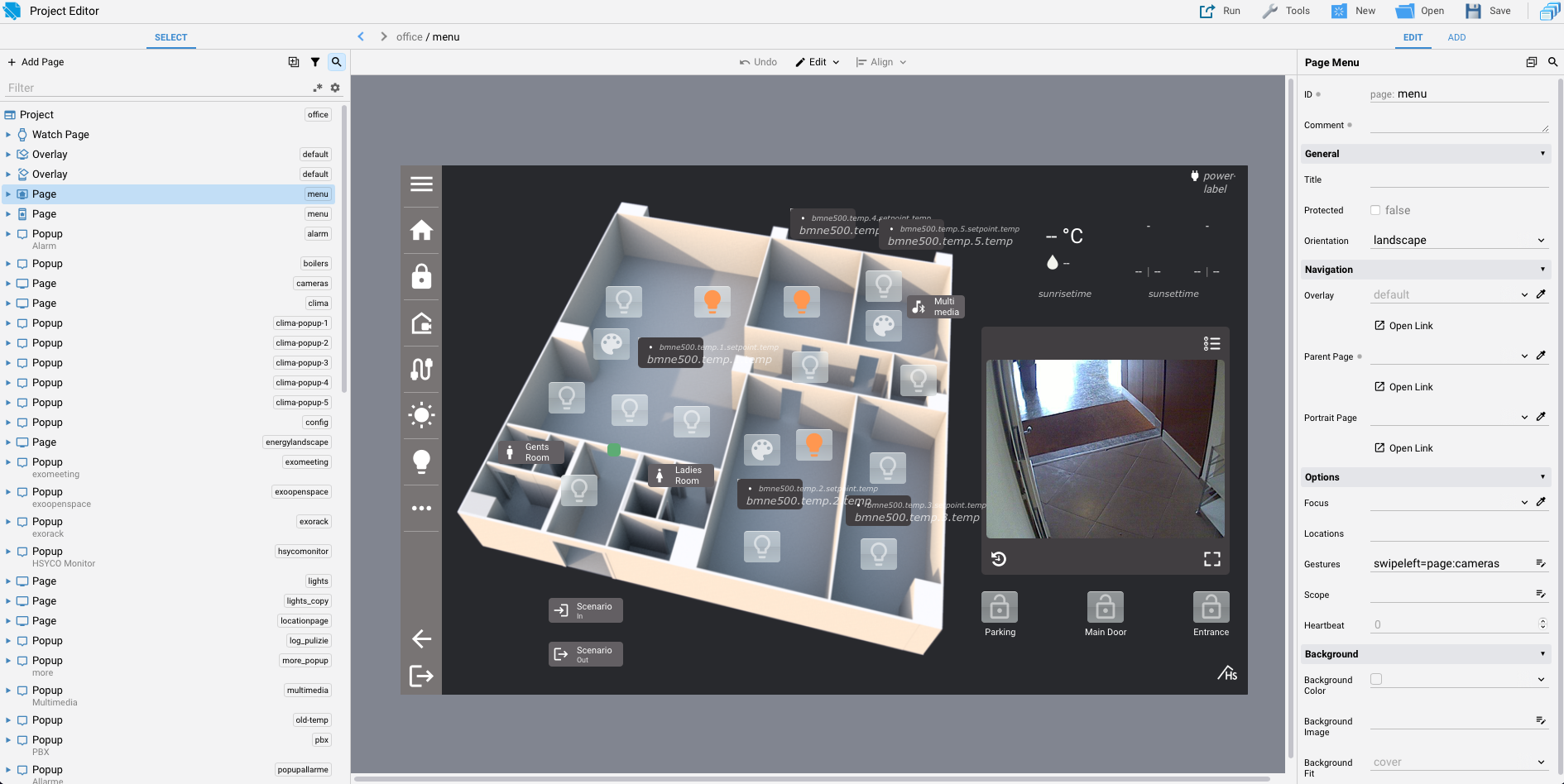
From the Manager splash screen click on Project Editor.
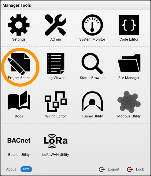
From the welcome screen it is possible to create a new project or open an existing one.
Click on New Project to open a new popup window:

Type a name for the new project.
Names starting with "manager" are reserved.
Project names can contain only lowercase letters, numbers, hyphens (-) and underscores (_).
Click on the button "Create" to create the new project.
If you want to make practise with the Project Editor tool, we recommend following this tutorial:
Alternatively, you can continue reading this section, where we will provide a detailed description of the Project Editor.
The Project Editor is divided into three main sections. In the central part, you can see the project page that you are currently editing. In the left column (1), there is a tree list of all the project pages and the objects contained within the pages. In the right column(2), you will find the attributes of the selected page or object or a group of selected objects.
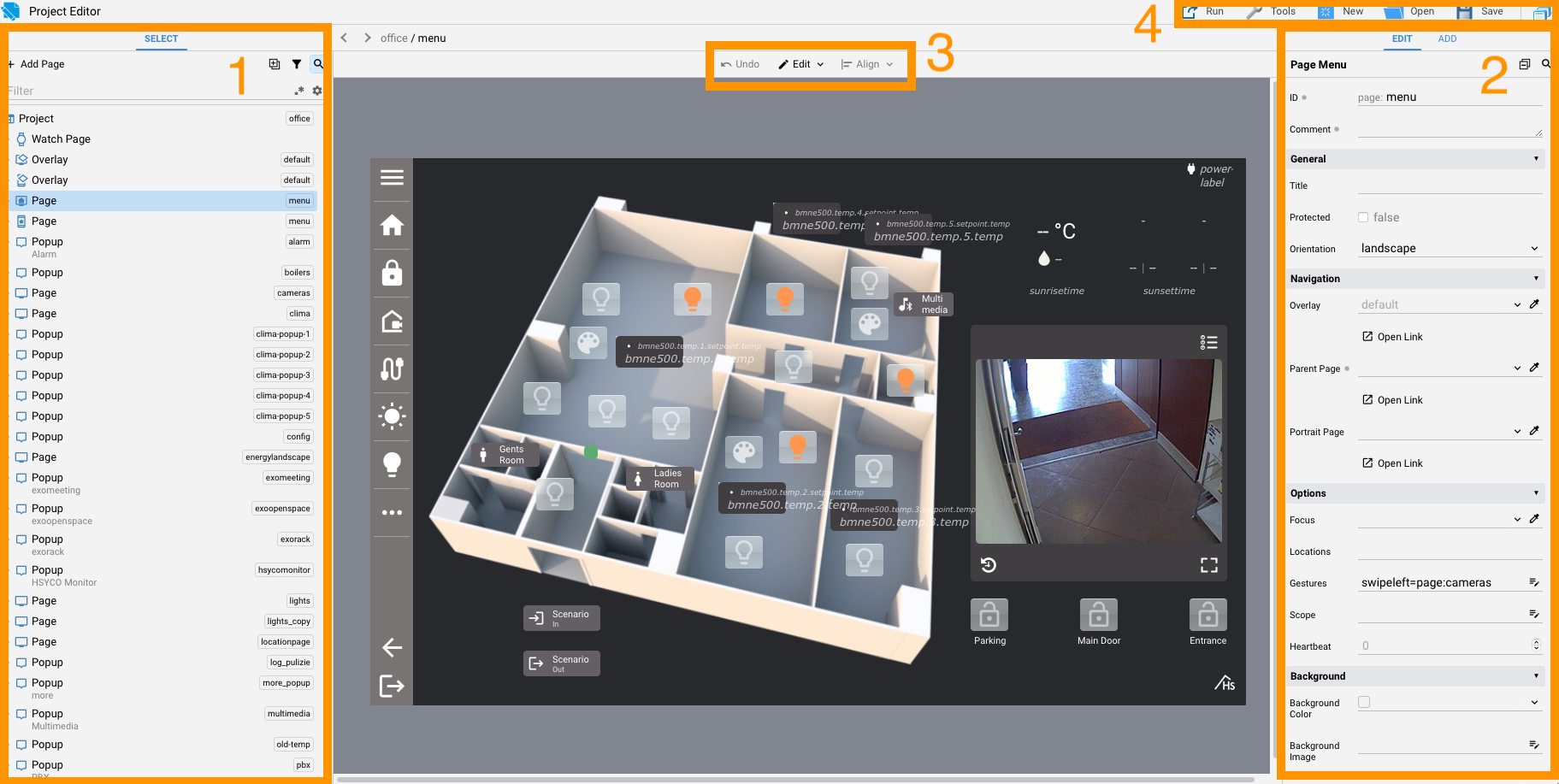
In the top center, there is a menu for alignment and undo operations (3), and in the top right, there is a quick menu for saving the project and other functions (4).
The Manager Assistant can use Project Editor context to inspect project pages and objects. With an OpenAI or Gemini Manager profile, it can also materially improve the composition of the visible page. Describe the hierarchy and region emphasis you want; the Assistant captures the current page with its active skin, creates a path-grounded design brief, generates and visually reviews a PNG mockup, reconciles an accepted candidate with real HSYCO object paths, and applies safe geometry changes as unsaved edits. It then captures the real rendered result, compares it with the accepted mockup, and can apply one revision-checked geometry correction before a final comparison.
The 4.2 layout workflow changes only pos, width, and height on visible existing objects. It does not create, delete, rename, reparent, restyle, or change component behavior. The director and final layout pass share a compact HSYCO geometry rubric: one primary region, clear scan order, task-based proximity grouping, shared edges, differentiated gaps, content-aware sizing, and no newly introduced clipping. The generated PNG is an aspirational layout reference, not the runtime result: the critic checks that its composition is materially different and more coherent, remains viable when projected onto the unchanged current-skin components, and has macro geometry that can be extracted safely. Arbitrary rearrangement and grouping that depends on generated headings, panels, backgrounds, or other candidate-only chrome remain below the novelty or skin-projection gates. Candidate-only typography, palette, borders, shadows, and other surface details are discarded. The rubric concerns visible fixed-canvas geometry only; it does not change or validate keyboard behavior, semantics, responsive reflow, screen-reader behavior, copy, typography, colors, or motion. One corrected candidate is allowed.
Review the returned brief, quality scores, mockup, reconciliation status, and explanation before saving. Initial and corrective geometry changes remain unsaved and use the normal object-level Project Editor Undo history, so reverting a result can require several Undo actions. A post-apply capture or comparison failure is reported after the initial edits instead of implying that the page was unchanged. Nothing is saved automatically. If the page changes before the initial revision-checked apply, no change is applied; a later revision mismatch prevents the optional correction. The temporary roughly 2K source capture, critic inputs, generated mockup, and post-apply captures are sent to the selected AI providers; the source, rejected candidate, and post-apply captures are not stored as Assistant artifacts, while the accepted mockup is kept with the session. The additional high-detail comparisons increase latency, vision tokens, and provider cost.
To add an assistant chat to a project for end users, configure a supported project object with the ai-assistant action. See Client Assistant.
The Select tree
To the left in the Project Editor interface, there is a column containing the tree structure of our project's elements. This column lists all the pages, and for each page, it displays all the objects. The width of the column can be adjusted. Selected items can be dragged and dropped to other pages.
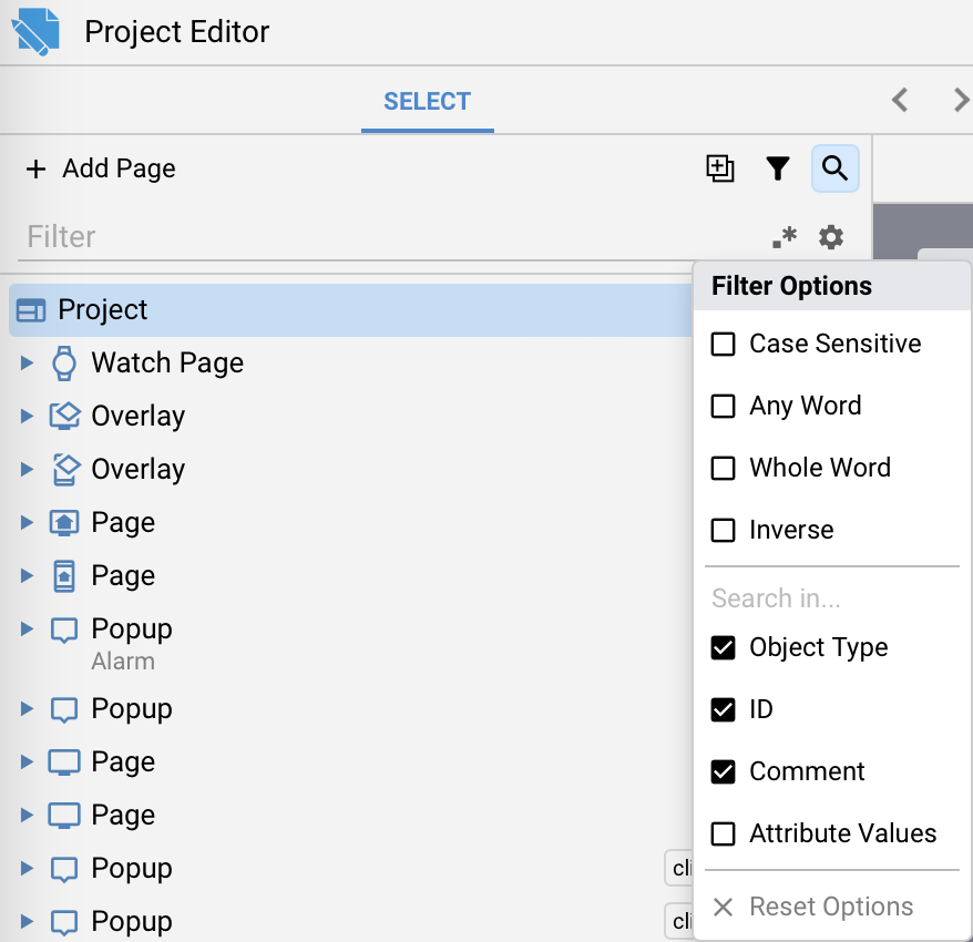
Select tree filter options
In the filter section, you can perform a search with various filter options.
-
Case Sensitive: This option indicates whether the search is sensitive to the capitalization of letters. When enabled, it will only return results that exactly match the letter case you've specified. For example, a search for "apple" with case sensitivity enabled will not match "Apple" or "aPpLe."
-
Any Word: Selecting this option in a search box means that the search will return results containing any of the words you've entered. It's useful for finding documents or content that contain at least one of the specified words, regardless of their order or combination.
-
Whole Word: When this option is chosen, the search will exclusively return results where the entire word you've entered matches completely. It won't retrieve partial matches or words that contain the search term as a part of a longer word. For instance, a search for "cat" with this option will not match "category."
-
Inverse: Inverse search, also known as "NOT" or "Exclude," is an option that excludes specific terms or words from your search results. When you use this option, the search will return results that do not contain the word or phrase you've specified. It's valuable for narrowing down your search by eliminating unwanted content.
You can search in the Object Type, item IDs, Comments, or attribute values.
You can also use a regular expression.
At any time, you can reset the filter options.
Project attributes
Selecting the first element of the tree opens on the right the project attributes list. The description of each available attribute can be read in the Project Attributes section.
Adding a new page
Pressing the button "Add Page" opens a popup window:
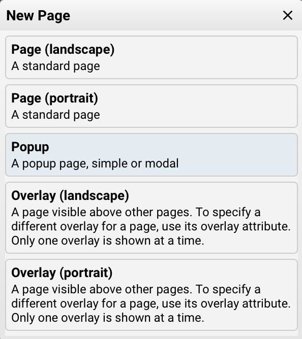
There are five different types of pages in HSYCO: regular pages with landscape or portrait orientation, overlay pages with landscape or portrait orientation, and popup pages.
Landscape mode refers to interfaces with horizontal orientation designed for PCs and tablets, while portrait mode refers to interfaces with vertical orientation designed for smartphones. Popus are not affected by orientation, they can be used in both landscape and portrait mode.
If the project supports the orientation mode, pages (all but popups) can have two versions with the same id and an orientation that can be portrait or landscape. When opening a page with a specific id, the page with the corresponding id and current orientation will be chosen. If it's missing, the page with same id but different or missing orientation value will be chosen instead.
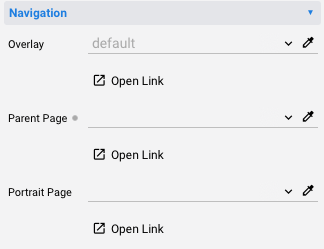
It is possible to specify the corresponding page orientation as either landscape or portrait for each page. Additionally, you can define an overlay and a parent page.
Page and popup attributes
Choosing a page in the Select tree reveals the list of page attributes in the right-hand column. The description of each available attribute can be read in the Page Attributes section.
Choosing a popup in the Select tree reveals the list of popup attributes in the right-hand column. The description of each available attribute can be read in the Popup Attributes section.
The attributes column
The Edit tab
In the right column of the Project Editor, in the Edit tab, you'll find a list of attributes for the currently selected item in the Select tree.
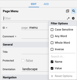
Attribute column filter options
In the filter section, you can perform a search with various filter options.
-
Case Sensitive: This option indicates whether the search is sensitive to the capitalization of letters. When enabled, it will only return results that exactly match the letter case you've specified. For example, a search for "apple" with case sensitivity enabled will not match "Apple" or "aPpLe."
-
Any Word: Selecting this option in a search box means that the search will return results containing any of the words you've entered. It's useful for finding documents or content that contain at least one of the specified words, regardless of their order or combination.
-
Whole Word: When this option is chosen, the search will exclusively return results where the entire word you've entered matches completely. It won't retrieve partial matches or words that contain the search term as a part of a longer word. For instance, a search for "cat" with this option will not match "category."
-
Inverse: Inverse search, also known as "NOT" or "Exclude," is an option that excludes specific terms or words from your search results. When you use this option, the search will return results that do not contain the word or phrase you've specified. It's valuable for narrowing down your search by eliminating unwanted content.
You can search in the Name or Value of each attribute.
You can also use a regular expression.
At any time, you can reset the filter options.
Attribute sub menu
Clicking on the name of each individual attribute opens a submenu where you'll find the following options:
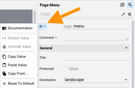
The Documentation button opens a popup with the documentation related to the selected attribute
It is also possible to Copy or Paste the attribute value of Copy From another attribute.
You can reset to the default value in any moment.
Set as Default Value makes the current value the project default for that object type and attribute. Objects with an explicit value keep their override. Use Update Default Value to replace the project default, Clear Default Value to remove it, or Reset to Default to remove an individual override.
These actions also apply to nested object attributes, such as the width of a table column or the label of a form item. A default applies to every item of that type throughout the project, including nested items and other objects that share the item type. Object and item defaults use the same project Defaults attribute. Open the project’s Defaults attribute to manage these entries in a popup editor. Each entry has Type, Attribute, and Value fields. For example, type tcol, attribute width, and value 180 give table columns an inherited width of 180 pixels: tcol identifies the item type, not an individual column.
Editing or removing an entry updates objects and items that inherit that default.
Changing a default from a popup editor saves your edits and closes the popup. Use Undo to revert the change.
AI image generation
When an OpenAI or Gemini profile is enabled for Manager users, image attributes show an AI image button next to the image picker. The popup's workflow panel lets you choose Image, Icon, or Floor plan and, when the attribute already contains an image, New or Edit. New mode creates a separate asset; Edit mode uses the assigned image as the source. When the attribute is empty, only New mode is available.
Enter a description of the image you want, then choose the AI profile, model, resolution, and aspect ratio. The initial resolution is selected to be close to the source image, when one exists, while the initial aspect ratio follows the selected object's dimensions as closely as the model supports. The estimated generation cost is shown before generation and includes the catalog estimates for the prompt, optional source image, and output image.
In Image/New mode, you can optionally add one PNG or JPEG reference by dropping a file, browsing for it, or pasting an image from the clipboard. Use the Output selector to choose PNG or JPG. For an existing image, Save as new image is enabled by default. You can change the proposed filename or turn the option off to replace the original file. You can also choose between the project's image directory and the shared www/img directory.
Generated images remain temporary while the popup is open. You can switch between the original and generated thumbnails for comparison, change the prompt or settings, and select Generate again to replace the preview. Generation controls are locked until each request finishes. Select Save to store the generated image and update the attribute, or close the popup to discard it without changing any file. Provider errors are shown in a separate message popup; closing it returns to the image editor so you can revise the request.
In Icon mode, describe the icon you need and choose the final resolution of one icon. The available resolutions account for the selected model's output sizes and aspect ratios, the centered square crop, and the 2 × 2 split. The Project Editor builds two black-on-white 2 × 2 style references from eight icons in the project's current icon set and asks the selected AI model for four matching variations with the same relative size and padding. In Edit mode, the current image is supplied first so the model preserves its subject while matching the project icon style. If the model cannot generate a square image, the four-icon grid is kept inside a centered square area and the unused outer bands are removed automatically. Results with missing variations or foreground touching a cell boundary are rejected. Select any variation, regenerate until you are satisfied, then choose the project or shared image directory and use Output to save it as a transparent PNG or a traced SVG vector. Selecting SVG traces the chosen variation and changes the single large preview to the non-destructive 24 × 24 vector result. Switching back to PNG restores the raster preview. Only the selected variation is stored; PNG output preserves antialiased edges, while SVG output contains a normalized black vector path.
In Floor plan mode, add a PNG or JPEG plan by dropping, browsing, or pasting it, or use the image already assigned to the attribute. Choose a visual style such as Realistic 3D, Clean architectural, Warm contemporary, Scandinavian, Architectural model, or Illustrated. You can optionally describe materials, colors, furniture, or room use. The source plan remains the architectural reference: the generation request asks the model to preserve its footprint, rooms, walls, doors, windows, fixtures, orientation, and proportions while removing photographic backgrounds, paper edges, dimensions, and labels. The result is a conceptual 3D cutaway visualization; always verify its layout before using it where architectural accuracy is required.
The Add tab
Selecting the "Add" tab grants access to the palette containing the objects available in the Project Editor.
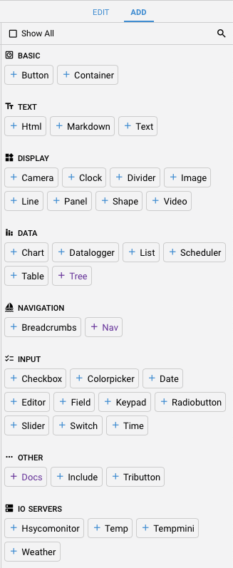
The description of each single object is available in the Objects section of this tutorial.
By selecting "Show All" in the upper section, all available objects will be displayed, including those from the I/O Server that have not been declared.
You can filter objects using the filter field; it also accepts regular expressions as input.
Moving objects on the page
Drag an object on the page to move it together with any other selected objects. Hold [Alt] ([Option] on macOS) while dragging to restrict movement to the horizontal or vertical axis.
Use the arrow keys to move selected objects by 1 pixel. Hold [Shift] while pressing an arrow key to move them by 10 pixels.
The Edit toolbar
The Edit toolbar consists of three buttons.

The Undo button when clicked reverses the most recent user action, effectively undoing changes made to the interface.
Edit menu
The Edit button opens a submenu.
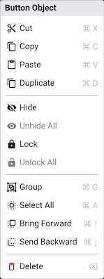
This context menu allows you to perform various operations on the selected items.
Cut, copy, paste can be used across different pages and projects.
The Delete option removes the selected items.
The Duplicate option creates a copy of the selected items.
Hide and Lock allow hiding and locking in place one or more items, to facilitate the editing of the interface. This option is saved in the project file, but it doesn't affect the running project.
With Unhide All and Unlock all items in the active container (project, page or container object) are unhidden or unlocked.
Alignment menu
The Align button opens a sub menu with multiple actions that can be applied to a single object or a selection of objects.
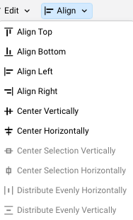
The menu is easy to understand; therefore, individual items are not explained.
The File menu
The File menu manages the project as a whole:
- New Project..., Open Project... and Open Recent Project: create or open a project
- Save Project: save the current project
- Save Project As...: copy the project folder, with its pages, images,
custom.cssand the other files in it, to a new project, save the current changes in the copy and continue editing the copy. The name can contain lowercase letters, numbers,_and-, and cannot start withmanager - Show in File Manager: open the project folder in the File Manager
- Rename Project...: give the project a new name, with the same rules as Save Project As
- Revert Project: discard the unsaved changes and reload the last saved version
- Version History: open a saved version of the project
- Close Project and Delete Project
The top right corner menu
At the top-right corner of the interface, there is a menu with various options.

The Run button opens a sub-menu which allows you to run the project in landscape or portrait mode or open the current page in a new browser tab.

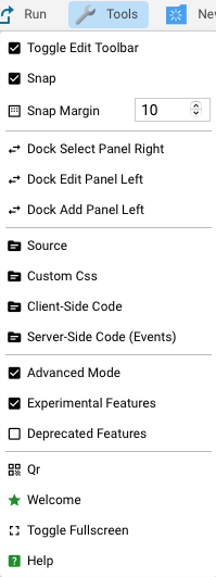
The Tools button opens a sub menu:
-
Toggle Edit Toolbar: show/hide the Edit Toolbar
-
Snap: enable/disable the automatic alignment snap between objects
-
Snap Margin: set the snap margin in pixel, default is 10px
-
Dock Select Panel Right: move the Select tree on the right column
-
Dock Edit Panel Left: move the Edit panel on the left column
-
Dock Add Panel Left: move the Add panel on the left column
-
Source: open the index.xml file of the current project in the Code Editor
-
Custom Css: open the custom.css file of the current project in the Code Editor
-
Client-Side Code: open the index.js file of the current project in the Code Editor
-
Server-Side Code: open the Code Editor in the EVENTS folder
-
Advanced Mode: enable/disable Project Editor advanced mode, showing all the attributes or a selected number
-
Experimental Features: enable/disable Project Editor experimentale features
-
Deprecated Features: show/hide deprecated Project Editor features
-
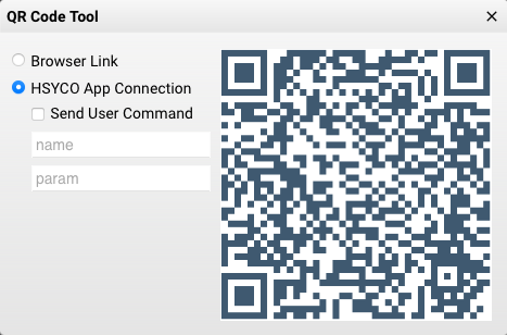
Qr: open the qr configuration popup where it's possibile to generate a qr for the URL to open the current project in a browser tab, or an URL for adding the current project to the HSYCO App or to generate a qr with an URL that sends an USER command to HSYCO
-
Welcome: open the Project Editor welcome screen
-
Toggle Fullscreen: activate or deactivate the full screen mode
-
Help: open the Project Editor docs
-
Report an Issue: describe a problem and prepare a portable ZIP report. You can optionally include the open Project Editor project, its images and media, open EVENTS files, and the current Assistant session. Unsaved Project Editor and Code Editor content is captured from the open buffers. Manager downloads the ZIP and opens an email draft containing the description and environment details. The ZIP contains a versioned
manifest.jsonfor future import tools. When a Manager AIGEN profile is available, the AI button generates an English title from the description using the first available profile's title model.
There are also some icon buttons for commonly used functions.
 Create a new project
 Open an existing project
 Save the current project. Saved project versions follow the Manager editor versioning retention policy.
 Return to the Manager splash screen